
Programming with Python
Analyzing Data from Multiple Files
Learning Objectives
- Use a library function to get a list of filenames that match a simple wildcard pattern.
- Use a for loop to process multiple files.
We now have almost everything we need to process all our data files. The only thing that’s missing is a library with a rather unpleasant name:
import globThe glob library contains a function, also called glob, that finds files and directories whose names match a pattern. We provide those patterns as strings: the character * matches zero or more characters, while ? matches any one character. We can use this to get the names of all the CSV files in the current directory:
print(glob.glob('data/inflammation*.csv'))['data/inflammation-05.csv', 'data/inflammation-11.csv', 'data/inflammation-12.csv', 'data/inflammation-08.csv', 'data/inflammation-03.csv', 'data/inflammation-06.csv', 'data/inflammation-09.csv', 'data/inflammation-07.csv', 'data/inflammation-10.csv', 'data/inflammation-02.csv', 'data/inflammation-04.csv', 'data/inflammation-01.csv']As these examples show, glob.glob’s result is a list of file and directory paths in arbitrary order. This means we can loop over it to do something with each filename in turn. In our case, the “something” we want to do is generate a set of plots for each file in our inflammation dataset. If we want to start by analyzing just the first three files in alphabetical order, we can use the sorted built-in function to generate a new sorted list from the the glob.glob output:
import numpy
import matplotlib.pyplot

filenames = sorted(glob.glob('data/inflammation*.csv'))
filenames = filenames[0:3]
for f in filenames:
    print(f)

    data = numpy.loadtxt(fname=f, delimiter=',')

    fig = matplotlib.pyplot.figure(figsize=(10.0, 3.0))

    axes1 = fig.add_subplot(1, 3, 1)
    axes2 = fig.add_subplot(1, 3, 2)
    axes3 = fig.add_subplot(1, 3, 3)

    axes1.set_ylabel('average')
    axes1.plot(data.mean(axis=0))

    axes2.set_ylabel('max')
    axes2.plot(data.max(axis=0))

    axes3.set_ylabel('min')
    axes3.plot(data.min(axis=0))

    fig.tight_layout()
    matplotlib.pyplot.show()
inflammation-01.csv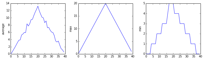
inflammation-02.csv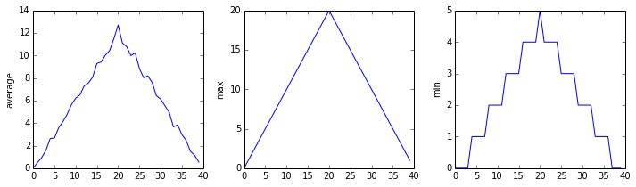
inflammation-03.csv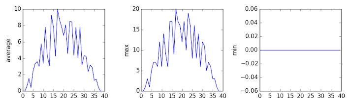
Sure enough, the maxima of the first two data sets show exactly the same ramp as the first, and their minima show the same staircase structure; a different situation has been revealed in the third dataset, where the maxima are a bit less regular, but the minima are consistently zero.
Plotting Differences
Plot the difference between the average of the first dataset and the average of the second dataset, i.e., the difference between the leftmost plot of the first two figures.
Solution
import glob
import numpy
import matplotlib.pyplot

filenames = glob.glob('data/inflammation*.csv')

data0 = numpy.loadtxt(fname=filenames[0], delimiter=',')
data1 = numpy.loadtxt(fname=filenames[1], delimiter=',')

fig = matplotlib.pyplot.figure(figsize=(10.0, 3.0))

matplotlib.pyplot.ylabel('Difference in average')
matplotlib.pyplot.plot(data0.mean(axis=0) - data1.mean(axis=0))

fig.tight_layout()
matplotlib.pyplot.show()